If you see or read anything on dA that absolutely awes you, please consider suggesting the piece for a DD feature. FAQ #18: Who selects Daily Deviations and how are they chosen?
I mentioned something to someone about projecteducate.
I'm not going to go into details, because that's not important. What's noteworthy is that they didn't have any idea what this wonderful group is. So, in the hopes of giving you some information on this wonderful endeavor put forth by the community and supported by deviantART, I wanted to show you some of their most recent articles. I know I mentioned them briefly in one of my plug sections, but I thought an in-depth look at the group might help you to see how useful this particular community group is.
The cover a wide variety of things, from product and program reviews:


to publishing tips for writers:
10 Reasons to ALWAYS Read Submission GuidelinesPublishing Week
Think you're too cool for submission guidelines? Think again...
1. It only takes five minutes.
2. And preparing your materials the right way will make you look professional (even if you’re just starting out. Or a cat).
3. It makes the editor’s life much easier, since they’re probably buried in paper to begin with.
Not that kind of paper!
4. And keeps them from becoming enraged at yet another improper submission.
5. And when the editor is happy, you’re more likely to get accepted!
6. Instead of outright rejected because you didn’t number your pages or something.
7. And if the lit mag you’re submitting to uses slush readers instead, they will also be relieved.
8. Instead of wanting to just crawl under the desk and die.
9. In short, read the guidelines for a happier publishing experience.
10. Or else.
How To get Published 2.0Publishing Week
It's been a little over 15 months since since I last wrote a "How to" Guide to Publishing for Project Educate. And guess what? Nothing has changed in the last 15 months. The greatest change to happen in Lit Mag submission is the ability to submit your work online. And some of the more established journals just want you to get out your SASEs. My previous article is still available for perusal. It was written specifically in regards to poetry submissions, but the general tenants hold for other lit subs as well.
However, I'm sure you all are craving that mineral –
I mean, ahem,new and pertinent informationNow with GIFs!
Here's the breakdown:
First catch your hare.
And by that I mean, write something. Write something that you want to have published. Write something that you will still want to have published once you've shopped it around to j
The In's and Out's of Book coversPublishing week
Hello All!!
My name is Jodie and I’ve been asked by Emily of CRLiterature to write a bit about design, or more precisely, design for book covers! I’m a part-time, freelance illustrator with a passion for reading and have had the great pleasure of illustrating a cover or two in the past few years for some very talented writers. I also have a lot of experience talking to authors about their ‘dream covers’ and then trying to explain why an epic fantasy scene or the main character in a heroic pose probably isn’t the best idea for their first self-published novel.
(On a side note, I'm not an expert in the area of book design/graphic design, but hope the little I do know helps you all to share your work with more people)
You’ve probably heard of the term ‘don’t judge a book by its cover’, and while this is a very good piece of advice, it’s actually pretty useless when it comes to trying to sell bo
to better tools for photography:
and tools for traditional art:
ATB: An Introduction to PensArtist's Tool Box
HelloI'm here to talk to you about Pens
Specifically, Micron Pens, Prismacolor Pens and Copic Multiliner Pens. I'm going to go over the pros and cons of each type and then talk a little bit about technique.
Micron Pens
Sakura Micron Pens seem to be one the most popular go-to pens for traditional artists. They retail at about $3.50-$4.00 Canadian, less if you can hit Michael's with a 40% of coupon. They come in a variety of sizes from 0.05mm to 1mm. They also come in brush tip. They are available in black, light blue, dark blue, sepia, orange, yellow, red, pink, purple and green. They are archival ink and acid free. The ink is supposed to be waterproof and fade proof... but that's where it falls down.
Water based markers will smudge the pen and alcohol based markers can leach some of the colour from the pen ink as well. If you pencil your work and then go over it in
Tools for using Soft PastelsArtists Toolbox
Hello Deviants!
Today I will be telling you about how to use soft pastels. It is my favorite traditional tool, mainly because I get my fingers all messy while drawing and really feel close to the paper.
What do you need when you want to draw with soft pastels?
Soft pastelsA surface to draw onTissuesA kneaded eraserFixative
About soft pastels
What is special about soft pastels is that they are dry and will turn into dust. While oil pastels will stick, soft pastels will create a powder that is easy to scatter. This gives a lot of freedom in mixing colors, and it is really fun to use!
About the surface
The traditional choice for soft pastels is paper. The best is to choose textured paper, as it will hold the soft pastel a lot better. Traditional paper may be too smooth. Canvas should be avoided as the medium doesn't stick very well to it.
A great tip when working with soft

:thumb524238446:
PE: Tools for taking care of Copic Markers Artist's Toolbox
Introduction
After purchasing some Copic markers they can be a little intimidating on how to look after them. The ideas put forth in this article may also be useful for other brands of refillable markers, but always consult the product's webpage for tips and tricks on how to maintain them.
Firstly, these are the official resources: Downloadable Resources in PDF format or Copic AU FAQ which are the official methods for performing the tasks mentioned below.Note: For best care of markers be careful when replacing and refilling as it is easy to damage markers further, try not to leave the nib removed for a prolonged period of time.
Storing your Markers
When storing any markers ensure that that the caps are placed back on squarely on both ends of the marker

Tools that can span digital and traditional realms:
and ideas for just the digital artist:
They strive to introduce areas of the site not necessarily well-trafficked:
Meet the Fractal Community #19Fractal Art Week
Hello and welcome to a new edition of Meet the Fractal Community, a forthnightly series of interviews that highlights a member of our community. The series will go back and focus on fractal artists.
Today, let's have a closer look to aartika-fractal-art.
:iconaartika-fractal-art:
Hello aartika-fractal-art! How are you today?
:iconaartika-fractal-art:
I'm well, thank you.
Can you introduce yourself to the community?
:iconaartika-fractal-art:
Hello!
I’ve recently returned to DA having abandoned my old account a few years ago through disuse – my previous account was aartika. I’ve been working with fractal software on and off for about fifteen years, almost exclusively with Ultra Fractal (versions 2, 3, 4 and now 5!).
I live in the UK and am a little older than I’d like to be.
How did you discover fractal art?
:iconaartika-fractal-art:
When looking for a screensaver in 1999 I came across Doug
Enter the Spotlight: A Feature of the Once-UnknownFractal Week
Welcome to a special feature:
Enter the Spotlight: A Feature of the Once-Unknown
WITH YOUR HOST THOUGHTWEAVER!
ManicRice
Nucleus Uno and PlatterTowers
Depths of Menger and Hybrid Mess
<a href="https://www.deviantart.com/deviation/512097554">
and tools for those who work with that medium as well:
Q'n'D: Reflections and Transparency by Sabine62Fractal Art Week
Note: these are not the holy grail settings for reflections and transparency. They are what this is called: a quick and dirty approach for those who (like me for a long long time) need a place to start and experiment from. All in here is based on what I found out myself or what I was pointed to by kind fellow DA-members. If you find fault with it, have additional tips or whatever, please drop me a noteAlso, please remember, I am not a native speaker. Either ignore spelling- and/or grammar-mistakes or (even better!) point me to them if you like!
Errmm... Maybe it's not such a Quick tutorial after all... :}
Reflections
Open these parameters in Mandelbulb3D:
Mandelbulb3Dv18{
g....UZ....Y/...V.....A...UYnfe8ufK/.Ptiwe0DO.1EBFtYOzgyjwfIL7IrDfz9zaQ6FkJp2C.k
................................wNHUMCTBk.2........A.R/.................y.2...wD
...Uz6/..cE0.....E.1/...........9.....EC.....YasXG3c1nmD/.EnAnQD..Ug0pAnAp1.8QxM
z6EnAnQD
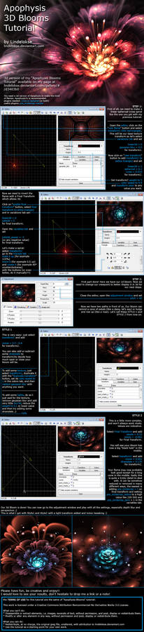
Prettify Your Bloom: Tips and TricksFractal Art Week
Hello!
Live with it: crafting flowers with Apophysis isn't the most original thing ever, but at least we can try to approach to the technique in another way and try to make them different from the multitude of results that can be found here on DeviantArt.
First of all, check the two blooms tutorials by lindelokse, which are the starting point for this technique: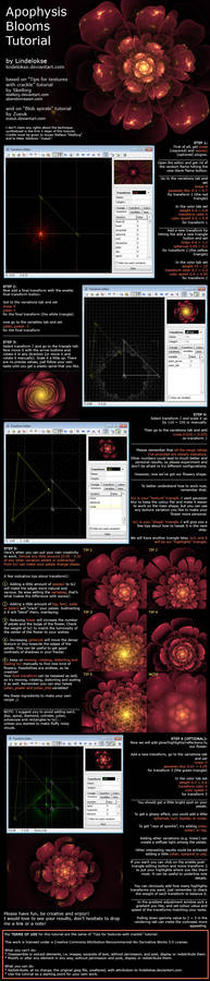
Before we start...
Just so you know, 2D flowers are generally more versatile and suitable for crazy experiments than 3D ones. You can use more variations and plugins on 2D flowers without messing the shape up (and they will still be as spectacular as 3D flowers).
Color and FractalsFractal Week
Fractals can be wondrous, colorful things. Color in artwork can exude life and vibrant energy that is inspiring to view. It can provide soul behind an image that draws you into the canvas created by an artwork, and engages your attention through a powerful, emotional response to what you observe. This article will be an amalgam of topics, covering utilization of color in fractals, some color theory, some examples, features, strategies regarding "color," and things to consider when choosing them.


If color is considered by viewing how "reds," "greens, "blues," and other tones interact and differ in artwork, then all the examples above are indeed colorful. However, this quality certainly isn't necessary in fractals; it's possible to make interesting things utilizing monochromatic gradient schemes.

How To Fractal WellFractal Art Week
A warm hello to the fractal community from heavenriver!
As a contribution to the upcoming Project Educate: Fractal Week, I present you with this article which will focus on (hopefully) useful advice on how to make your fractals better, by paying attention to a few simple, yet crucial components of fractal art. I will be using my own fractals as examples, not because I think they are the best of the best, but rather because there is criticism to do, and I would rather not inadvertently hurt anyone's feelings by taking their own fractals as examples.
Point #1: Colouring
A BAD example of colouring:
What is wrong with this? Contrast and balance. The former is exaggerate; the latter is nonexistent. Just to name one, the purple areas stand out too much overall, compared to the other colours; it's as if we had nothing else at all. The yellow at top kind of stands out too,
If you're not familiar with this group, please take a moment to check them out, and
Random Plug:
Tudalia-Hex has posted a journal about an interesting initiative here:
Apparently this is still going on, even though their main website says that this is a March event. If you'd care to show some support for Unicef's efforts (assuming you have a smart phone), please take a moment to check out the link.